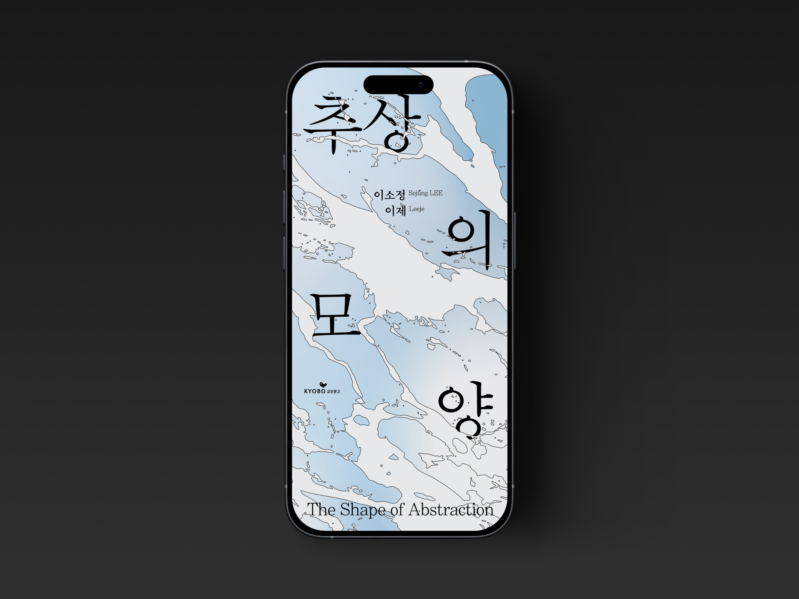
교보아트스페이스에서 열린 여성 2인전 「추상의 모양」은 동양화와 서양화라는 서로 다른 회화적 기반 위에서 각자의 시각 언어를 구축해 온 두 작가의 작업을 조명하는 전시다. 장르적 차이를 바탕으로 형성된 상이한 추상의 형식은, ‘서사가 소멸된 지점에서 다시 생성되는 서사’라는 개념으로 확장되며 감정의 층위를 탐구한다.
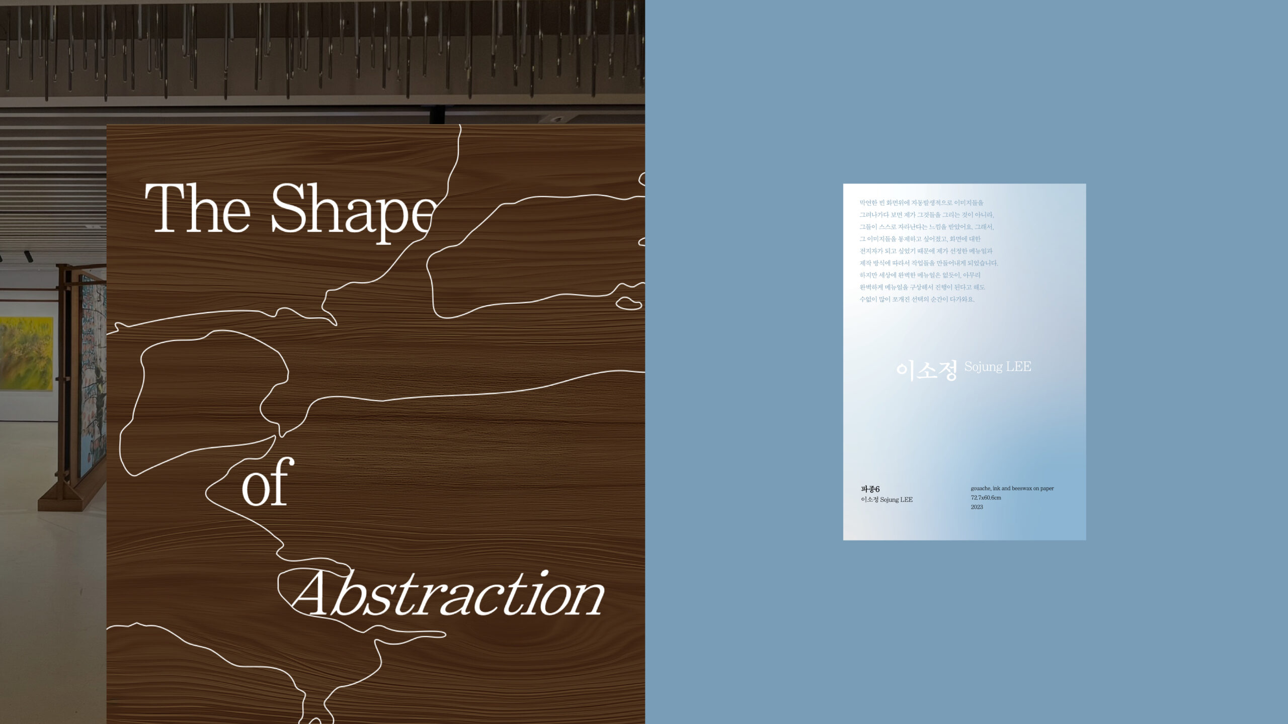
전시 디자인에서는 이 개념을 시각 시스템으로 구조화하는 데 초점을 맞췄다. 두 작가의 작업에서 공통적으로 드러나는 스트로크의 물성과 텍스처에 주목해, 거칠고 부드러운 붓질의 대비를 주요 모티프로 삼았다. 감정이 밀려들고 중첩되는 흐름을 파도의 움직임에 비유해 추상적 형태를 전개하고, 이를 키 비주얼 전반에 적용했다. 타이틀 타이포그래피 또한 고정된 배열 대신 분산과 확산의 구조를 취해, 감정에 따라 부유하는 듯한 리듬을 형성했다. 회화적 질감, 레이어의 중첩, 유동적인 타이포그래피를 통해 전시의 개념을 단순 재현이 아닌 디자인적 해석으로 확장했다.
“The Shape of Abstraction” at Kyobo Art Space presents two female artists rooted in Eastern and Western painting traditions, exploring abstraction as a space where narrative dissolves and re-emerges through emotion.
The design translates this concept into a cohesive visual system inspired by the tactile quality of their brushstrokes. Wave-like abstract forms and dispersed typography create a sense of emotional flow and accumulation, extending the exhibition’s conceptual framework into a clear and unified graphic language.