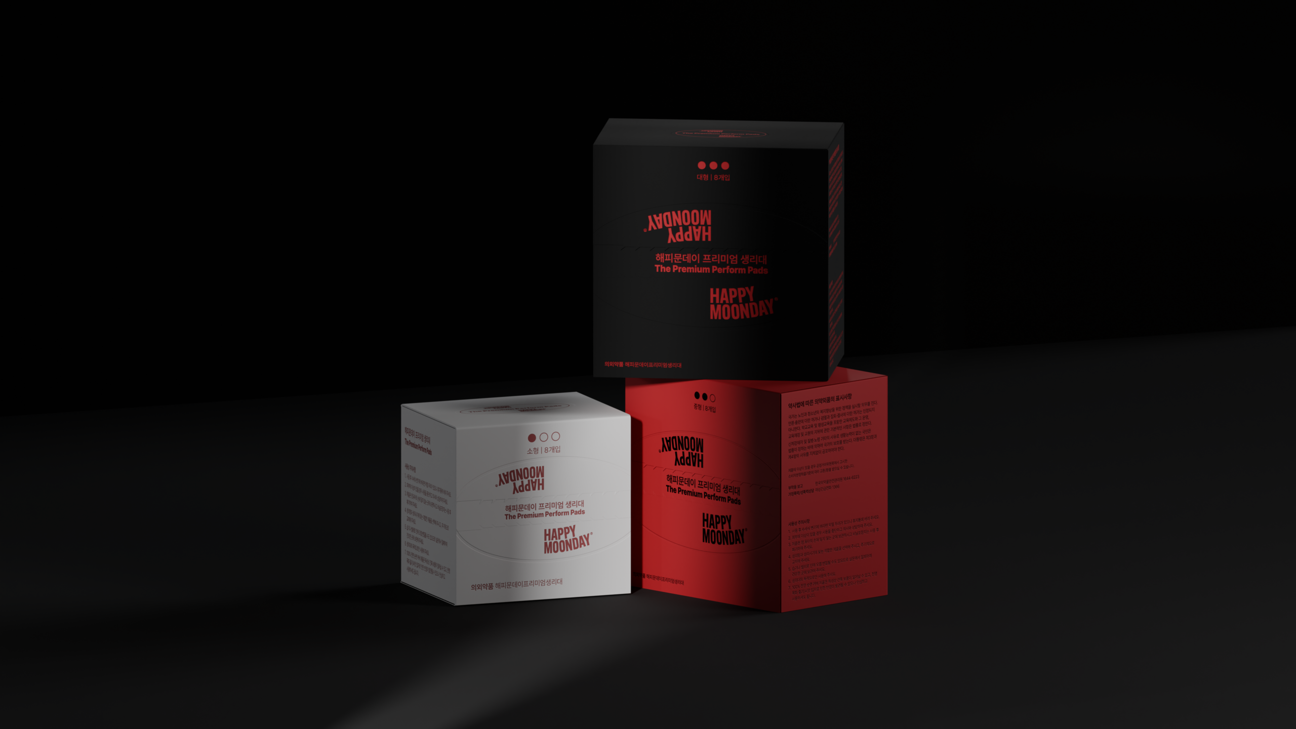
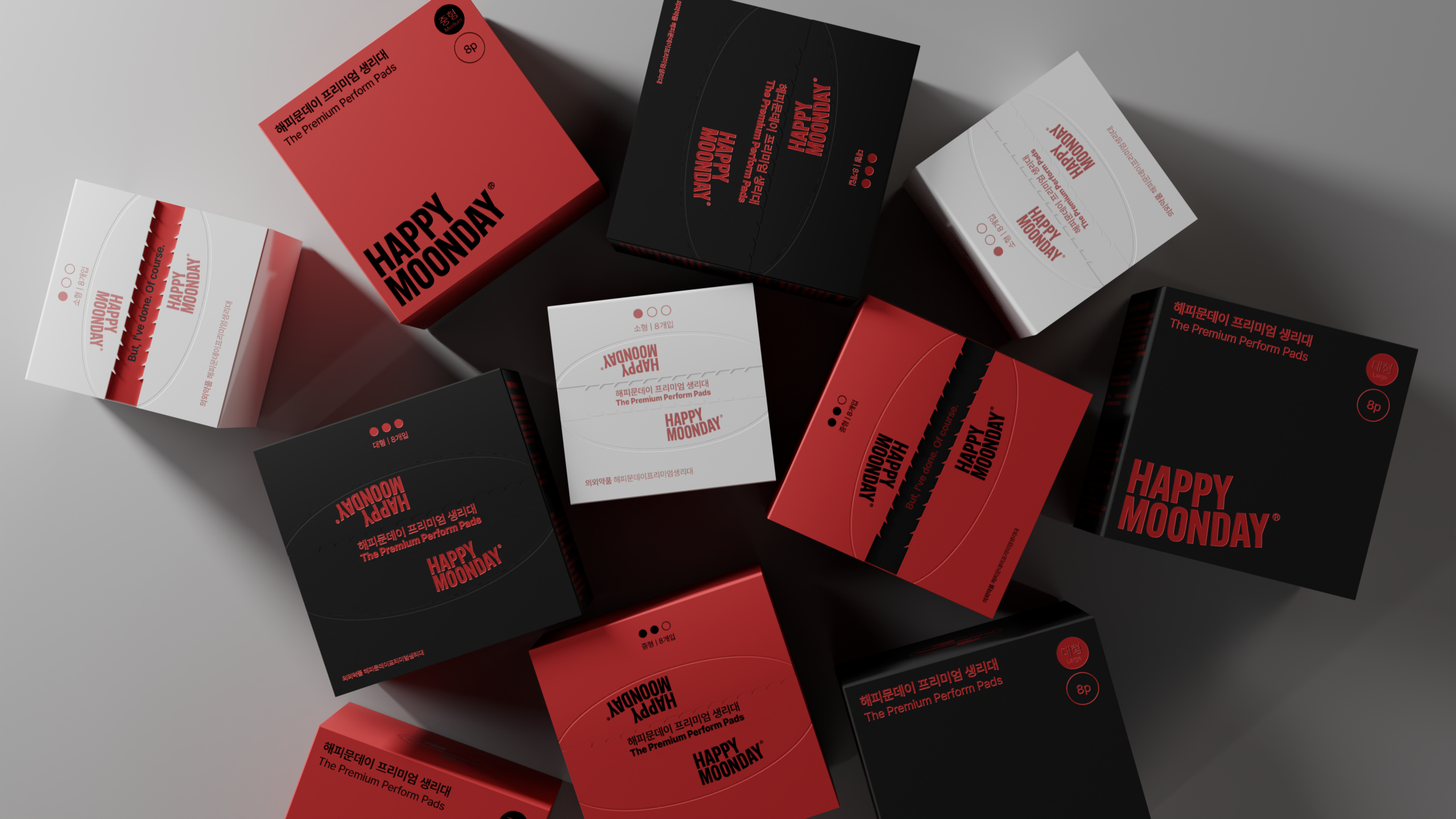
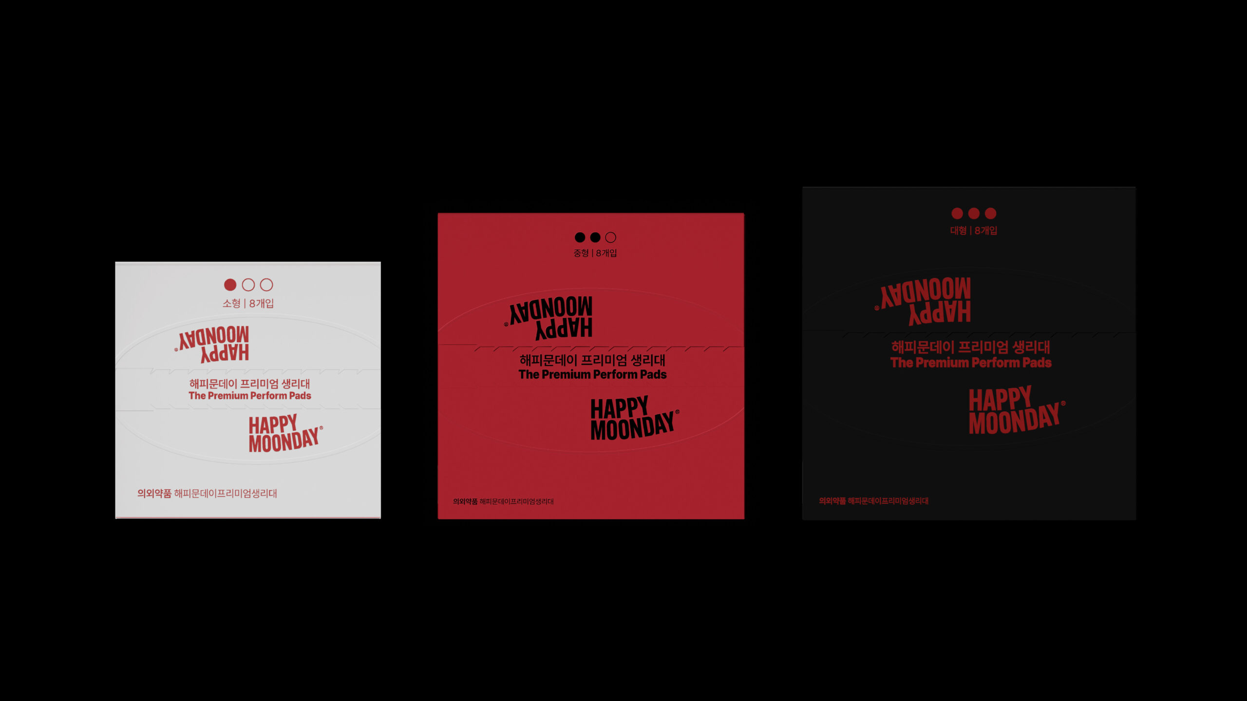
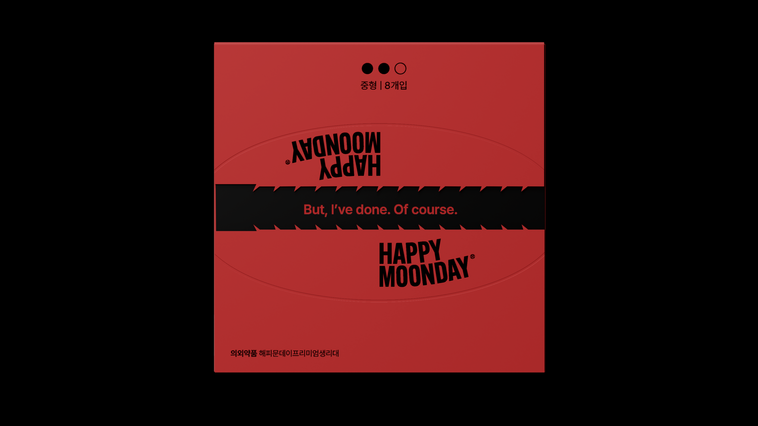
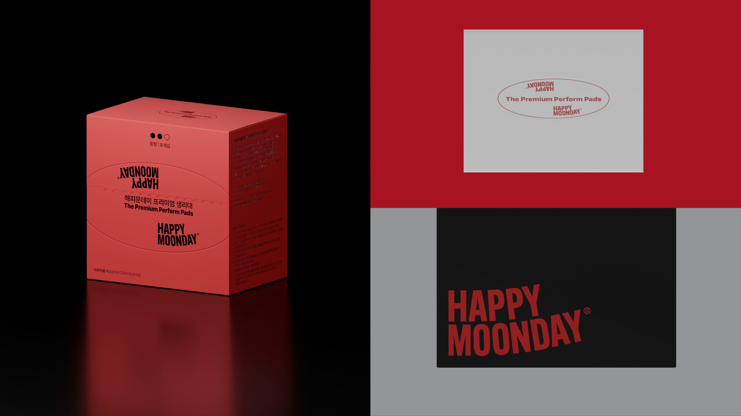
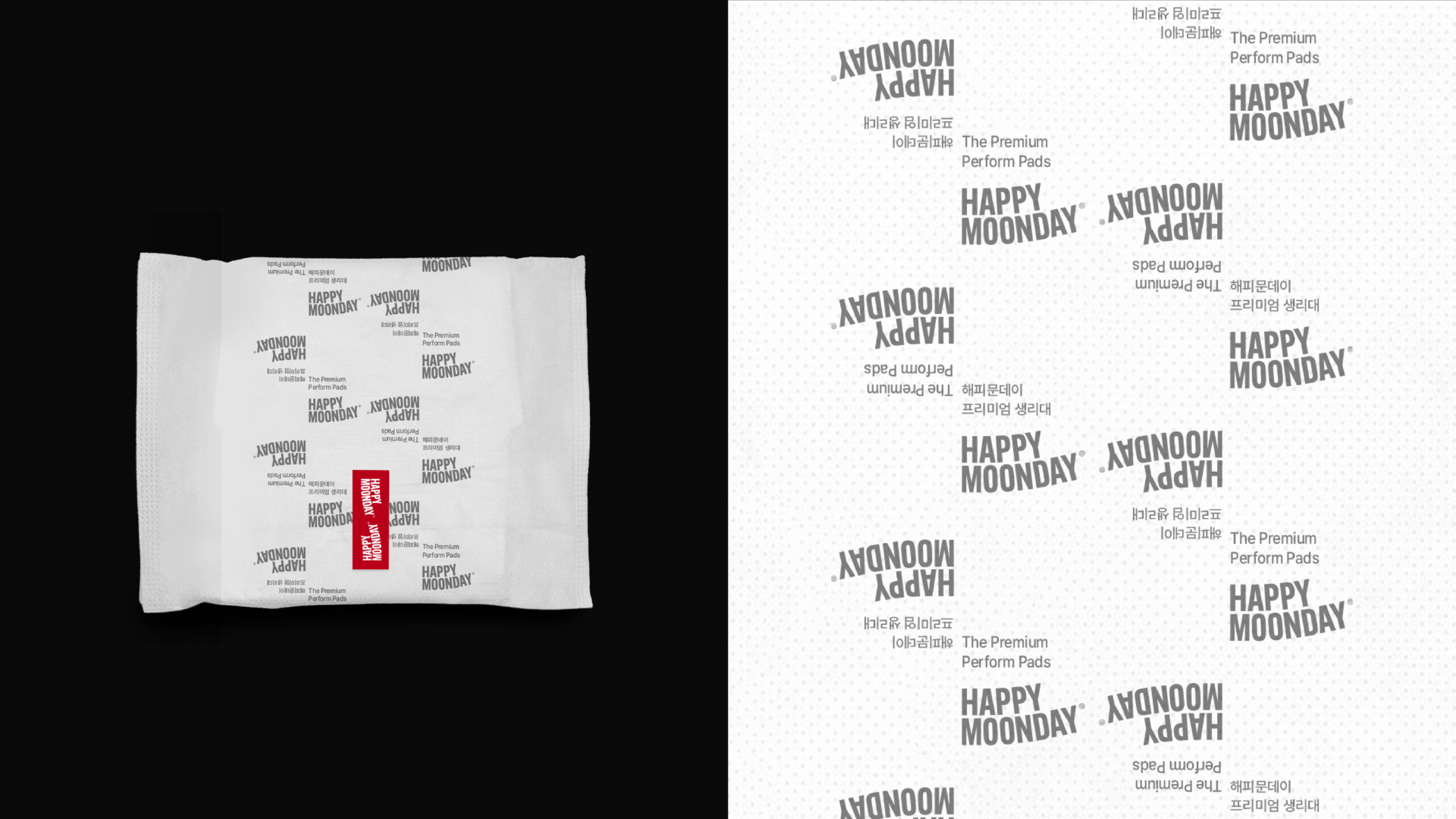
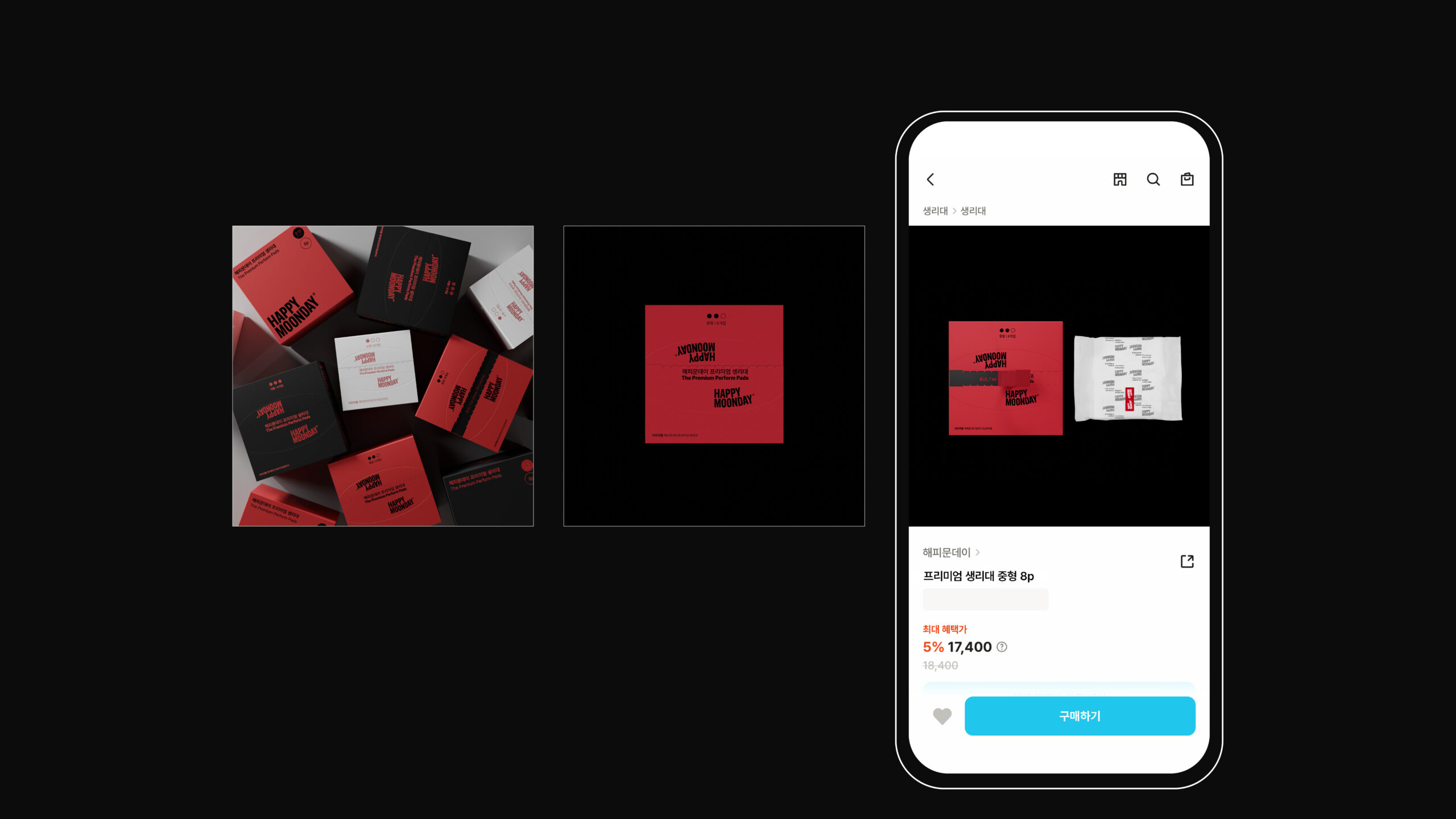
해피문데이 리브랜딩 이후의 브랜드 확장 가능성을 가정한 가상의 프리미엄 라인 브랜딩 개인 프로젝트다. 기존 여성용품 시장에서 반복되는 오가닉 중심의 메시지와 페미닌 무드, 유사한 패키지 구조에서 벗어나는 것을 출발점으로 삼았다. 감성적 접근 대신, 제품 정보 전달의 명확성과 브랜드 아이덴티티의 확장성을 고려한 패키지 시스템을 설계하며, 프리미엄 라인에 적용 가능한 구조적 기준을 제안했다.
브랜드 비전인 “더 많은 여성이 최대의 잠재력을 발휘하도록 돕는다”를 프리미엄 라인의 핵심 방향으로 재해석했다. 신체의 주기를 ‘관리의 대상’이 아닌 ‘조율 가능한 리듬’으로 정의하고, 이를 시각 언어와 커뮤니케이션 톤에 반영했다. 위로 중심의 표현을 지양하고, 현실에서 자신의 퍼포먼스를 지속하는 여성들의 태도에 초점을 맞춘 전략적 브랜딩 제안이다.
This is a self-initiated branding project proposing a hypothetical premium line for Happy Moonday, developed to explore the brand’s potential trajectory following its rebranding. The project begins by questioning the visual conventions of the femcare market—namely organic-driven messaging, overtly feminine moods, and homogeneous packaging formats. Instead of relying on emotional cues, the focus was placed on clarity of information, structural consistency, and a scalable packaging system that could support long-term brand expansion.
Interpreting the brand vision—“to help more women realize their full potential”—as a strategic foundation, the premium line reframes the menstrual cycle not as a condition to be managed, but as a rhythm to be calibrated. The visual language and communication tone were developed to reflect this perspective, shifting away from comfort-oriented narratives toward a positioning that acknowledges women who sustain performance in their everyday lives. This project proposes a strategic and system-driven approach to premium brand extension.
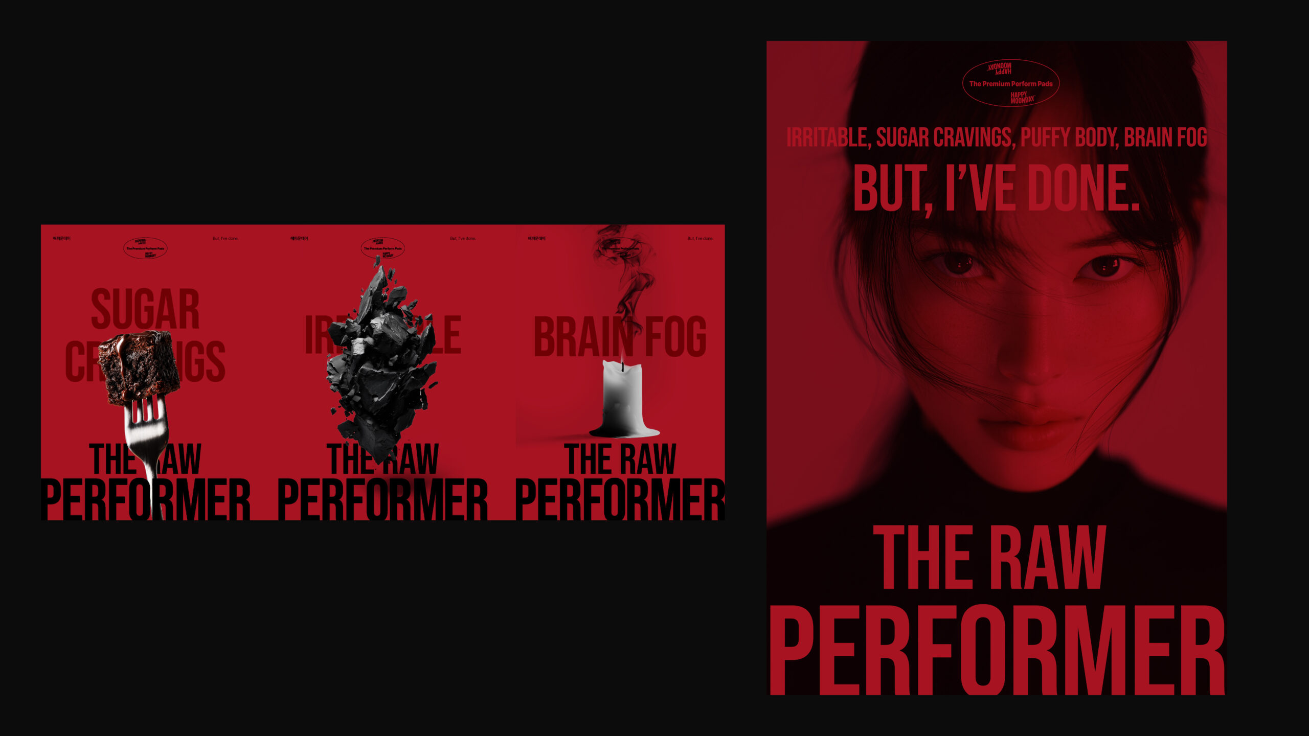
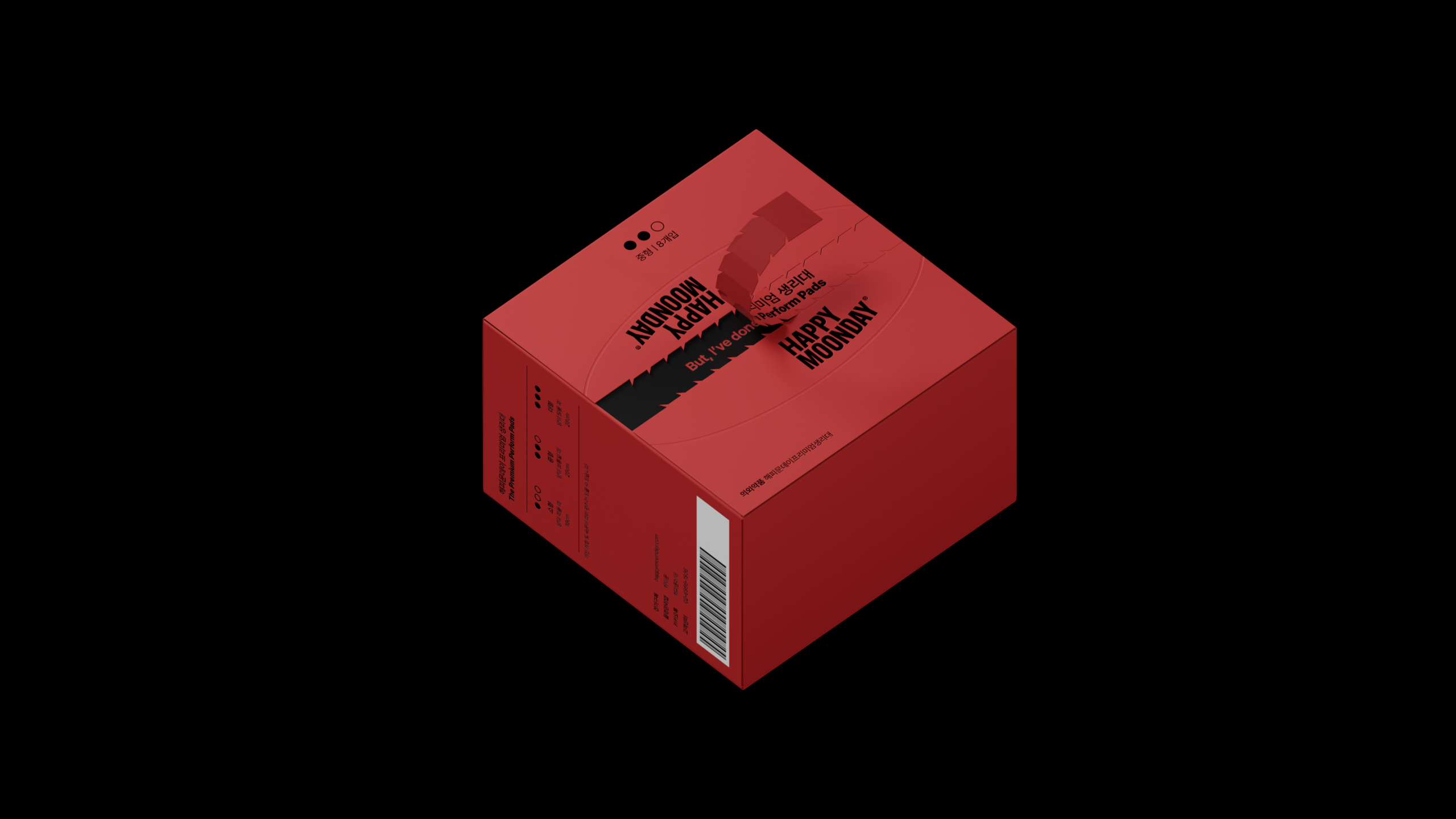
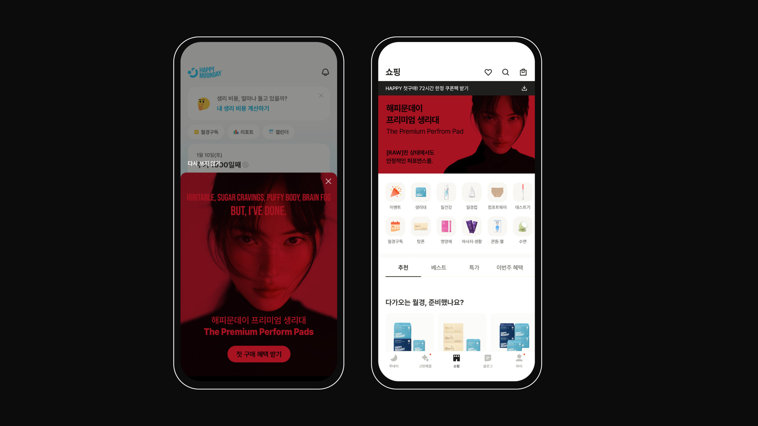
평범한 여성들이 겪는 일상의 불편함과, 그럼에도 자신의 퍼포먼스를 지속하는 태도를 키 비주얼의 중심 메시지로 설정했다. 현실 속에서 움직이고 일하며 역할을 수행하는 여성들의 지속성과 리듬에 주목했다.
이를 기반으로 새로운 프리미엄 라인의 패키지 디자인과 프로모션 비주얼을 전개했다. 키 비주얼의 메시지가 일관되게 확장될 수 있도록 그래픽 시스템을 설계하고, 제품–패키지–프로모션이 하나의 전략적 서사 안에서 연결되도록 구성했다.